Understanding Colour
The first known studies of colour were done in ancient Greece
by Aristotle, who theorized that colour existed in the form of
rays sent down from the heavens by God. His theory was undisputed
until the Renaissance when more sophisticated colour systems were
developed by Aguilonius and Sigfrid Forsius. Aguilonius's system
was the first attempt at defining all colours and was based on
his observations of the changing colour of the sky from dawn to
dusk. In 1660, Sir Isaac Newton developed a more logical colour
order based on his scientific observation from experiments. Using
a prism, he acknowledged that white light could be broken down
into the colours of the rainbow, and as such had a clear, set order.
I remember how we memorized these colours in school using the letters ”VIBGYOR” -
violet, indigo, blue, green, yellow, orange and red. I’ve
never forgotten it since!
So what is colour?
Colour can be defined by three properties:
When we call an object "red" or “blue” we
are referring to its hue. It is the most basic
name that can be assigned to a colour. A paint may be named “Ultramarine” but
we would say that its hue is blue. A paint named “Pumpkin” is
a yellow-orange.
The intensity of a colour refers to how dull
or bright it is and is also known as “saturation” or “chroma”.
It is the purity and strength of a colour. Colour intensity ranges
from neutral to brilliant. Two colours may have the same hue but
one is more vivid and the other, dull.
Value refers to how light or dark a colour appears.
The subtle gradations of dark to light are clarified by artists
using a “value scale” usually with 10 steps or increments
from dark to light. A colour’s value is increased, or lightened,
by adding white or another lighter value colour to it. The lightened
colours are called “tints”. A colour’s value
is decreased or darkened, by adding black or a darker value colour
to it. The darkened colours are called “shades”.
Colour Theory
Colour theory…is simply a set of principles and terminology
used by artists to talk about colour.
The Colour Wheel
The Colour Wheel visually presents colour relationships - it is
the colour spectrum presented in the form of a circle. It helps
us to understand colour relationships, colour schemes and also
allows us to identify how colour mixtures are derived.
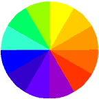
The Colour Wheel is most commonly presented using
12 colours placed in the order in which they appear when a beam of
light is passed through a prism. The colours that form the 12-part
colour wheel are categorized into primary, secondary and intermediate
colours.

Primary colours are colours at their basic essence
- yellow, red and blue. All other colours are mixed from them but
they cannot be created by mixing others.

Secondary colours are colours achieved by a mixture
of two primary colours. There are three secondary colours:
- Orange - derived by mixing Red and Yellow
- Purple - derived by mixing Blue and Red
- Green - derived by mixing Yellow and Blue

Intermediate colours are derived by mixing a primary
and its closest secondary colour on the colour wheel. Intermediate
colours are also known as “tertiary” colours and there
are six colours:
- Yellow-orange
- Red-orange
- Red-purple
- Blue-purple
- Blue-green
- Yellow-green
Colour Schemes
Colour schemes are a systematic way of using the colour wheel to
put colours together to create colour harmony. There are various
formulae for creating colour schemes but the more common schemes
are:
- Monochromatic
- Complementary, and
- Analogous
“Mono” means “one” and “chroma” means “colour”.
A Monochromatic colour scheme is one which uses
only one colour in various values i.e. in various degrees of lightness
or darkness.
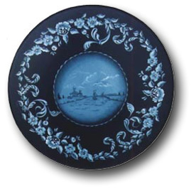
This Hindeloopen carousel is an example of a
project painted with various tints and shades of blue to create
a pleasing monochomatic colour scheme.
Complementary colours are opposite each other on the
colour wheel. Complementary colour schemes use greatly
contrasting colours such as green and red, purple and yellow etc.
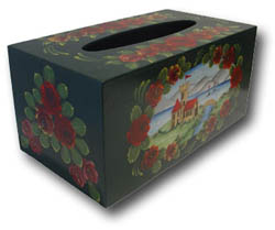
This English
Canalboat project is painted using
the complementary colours green and red and orange and their various
values.
An analogous colour scheme is one
which uses 3 - 5 colours which are adjacent to each other on the
colour wheel. This combination of colours provides very little contrast.

This multi-loaded iris plate was painted using
an analogous colour scheme comprising blue, purple, green and their
values.
Warm and Cool Colours
Warm and cool colours are terms used to also describe
a collection of colours. Warm colours are found on the right side
of the color wheel and cool colours are found on the left side of
the color wheel.
Warm colours are those identified
with fire and the sun. When used in a painting, they make objects
look closer or come forward.
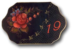
This zhostovo plaque was painted using warm colours
- crimson, red, orange and touches of yellow.
Cool colours are colours associated
with snow and ice. When used in a painting, they tend to recede or
go backward in a composition.
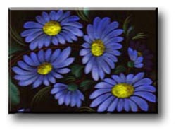
These zhostovo daisies on the other hand were
painted with cool colours - various values of blue and blue-green
were used. |